What are Accessibility metrics? Crafting the perfect Accessibility metrics can feel overwhelming, particularly when you're juggling daily responsibilities. That's why we've put together a collection of examples to spark your inspiration.
Transfer these examples to your app of choice, or opt for Tability to help keep you on track.
Find Accessibility metrics with AI While we have some examples available, it's likely that you'll have specific scenarios that aren't covered here. You can use our free AI metrics generator below to generate your own strategies.
Examples of Accessibility metrics and KPIs 1. User Satisfaction Score Measures how satisfied users are with the design, typically collected through surveys or feedback forms
What good looks like for this metric: Above 75%
Ideas to improve this metric Conduct usability testing regularly Gather user feedback and implement changes Improve aesthetics and functionality based on feedback Ensure the design is intuitive and easy to navigate Enhance visual appeal through modern design trends 2. Conversion Rate The percentage of users who take a desired action, indicating the effectiveness of design elements in driving user actions
What good looks like for this metric: 2% to 5%
Ideas to improve this metric Simplify navigation to increase user flow Ensure call-to-actions are clear and motivating Use persuasive design elements and language Test different design variations and iterate Optimise loading speed to reduce user frustration 3. Time on Page Average duration users spend on a page, reflecting engagement levels with the design
What good looks like for this metric: 2 to 3 minutes
Ideas to improve this metric Enhance content relevance and quality Implement engaging multimedia elements Improve readability through better typography Create purposeful and structured layouts Ensure content addresses user needs effectively 4. Bounce Rate Percentage of visitors who leave after viewing only one page, indicating initial engagement or dissatisfaction
What good looks like for this metric: 26% to 40%
Ideas to improve this metric Enhance landing page design Ensure content matches user expectations Improve page loading speed Add internal links and calls to action Use analytics to identify high exit pages 5. Accessibility Compliance Assessment of how accessible the design is for users with disabilities, ensuring a wider audience reach
What good looks like for this metric: WCAG 2.1 Level AA compliance
Ideas to improve this metric Conduct an accessibility audit Use proper HTML tags for structure Ensure colour contrast is sufficient Provide alternative text for images Make all functionalities accessible via keyboard
← →
1. Impact Factor Measures the average number of citations received in a year by articles published in the journal during the previous two years
What good looks like for this metric: Typical values range from 0 to 10 depending on the field
Ideas to improve this metric Increase the quality and relevance of published articles Encourage authors to cite published works in future papers Collaborate with renowned researchers to publish high-impact papers Promote journal content through academic conferences Optimise search engine visibility of journal articles 2. Citations Per Article Average number of citations received per article published in the journal
What good looks like for this metric: Averages vary significantly by discipline, commonly above 5 for high-impact journals
Ideas to improve this metric Encourage authors to engage in citation networks Promote open access to increase visibility and citability Publish review articles that tend to accumulate more citations Increase engagement with social media channels Facilitate easy access and sharing of articles 3. Submission to Publication Time Average time taken from the submission of a manuscript to its publication in the journal
What good looks like for this metric: 3-6 months is typical for many journals
Ideas to improve this metric Streamline the peer-review process Implement digital tools to manage manuscripts efficiently Ensure clarity in submission guidelines to reduce revisions Communicate regularly with authors and reviewers Offer expedited review process options for a fee 4. Acceptance Rate Percentage of submitted manuscripts accepted for publication
What good looks like for this metric: Ranges from 5% to 25% depending on journal selectivity
Ideas to improve this metric Establish clear publication standards Provide constructive feedback to authors for improvement Ensure rigorous peer-review process Maintain transparency in rejection criteria Adjust submission requirements to attract high-quality manuscripts 5. Journal Reach and Readership Measures the size and engagement level of the journal's audience, including geographic reach and reader demographics
What good looks like for this metric: 2000 to 5000 monthly visitors for established journals
Ideas to improve this metric Enhance outreach efforts through academic networks Develop partnerships with universities and research institutions Utilise email newsletters to engage and grow subscriber base Optimise journal content with SEO techniques Leverage analytics to understand and target audience interests
← →
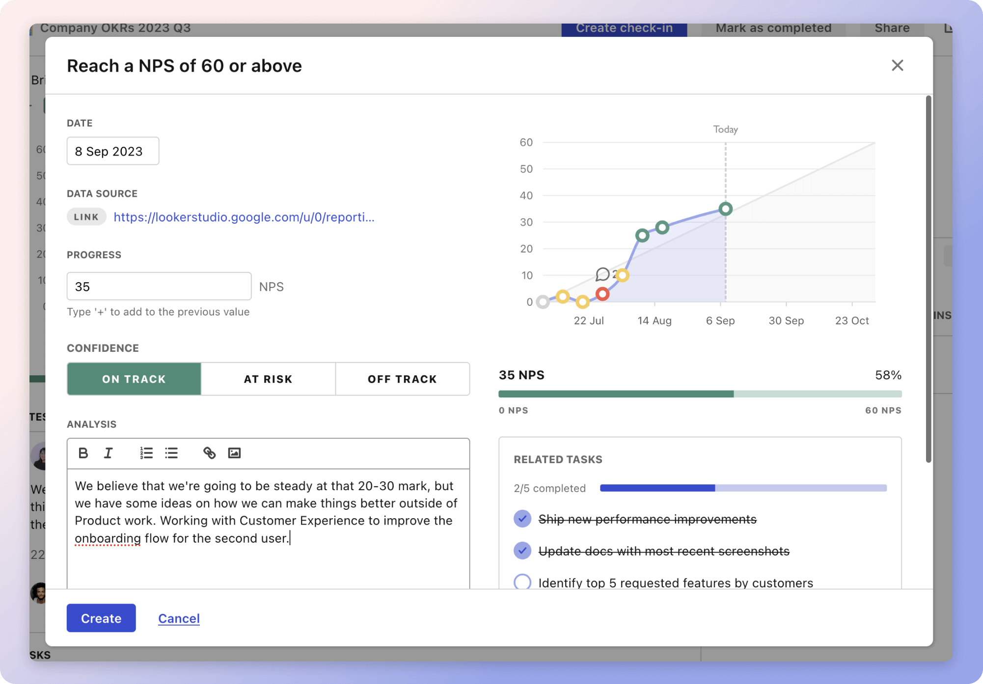
Tracking your Accessibility metrics Having a plan is one thing, sticking to it is another.
Setting good strategies is only the first challenge. The hard part is to avoid distractions and make sure that you commit to the plan. A simple weekly ritual will greatly increase the chances of success.
A tool like Tability can also help you by combining AI and goal-setting to keep you on track.
More metrics recently published We have more examples to help you below.
Planning resources OKRs are a great way to translate strategies into measurable goals. Here are a list of resources to help you adopt the OKR framework:
 Tability's check-ins will save you hours and increase transparency
The best metrics for Increase Calls Through Google My Business
The best metrics for GRC MSSP Compliance
The best metrics for Reduce Courier Costs
The best metrics for Reducing Courier Costs
The best metrics for Operations Management Success
The best metrics for Ensuring sticker quality