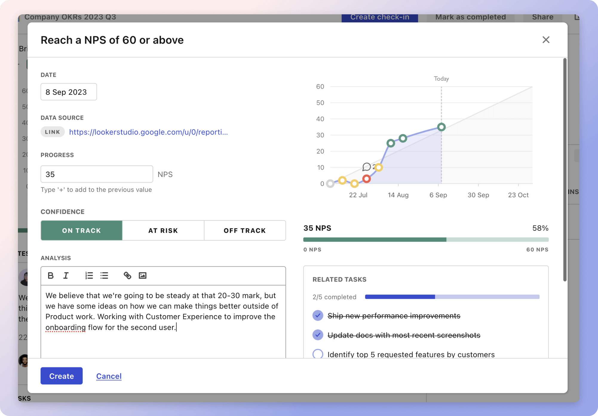
The objective, "Design Evaluation," focuses on refining design strategies through critical metrics. User satisfaction score gauges user contentment, emphasizing the importance of feedback to adapt designs effectively. For example, conducting usability testing can reveal insights into the user experience, prompting necessary adjustments. Metrics like the conversion rate and time on page reflect user engagement and highlight the necessity of intuitive navigation and engaging content.
Accessibility compliance is vital for inclusivity, ensuring access for users with disabilities and broadening the reach. By adhering to standards like WCAG 2.1 Level AA, designs ensure that all users can engage meaningfully. Metrics like bounce rate and conversion offer insights into user behavior and design efficiency, enabling ongoing improvement.
Top 5 metrics for Design Evaluation
1. User Satisfaction Score
Measures how satisfied users are with the design, typically collected through surveys or feedback forms
What good looks like for this metric: Above 75%
How to improve this metric:- Conduct usability testing regularly
- Gather user feedback and implement changes
- Improve aesthetics and functionality based on feedback
- Ensure the design is intuitive and easy to navigate
- Enhance visual appeal through modern design trends
2. Conversion Rate
The percentage of users who take a desired action, indicating the effectiveness of design elements in driving user actions
What good looks like for this metric: 2% to 5%
How to improve this metric:- Simplify navigation to increase user flow
- Ensure call-to-actions are clear and motivating
- Use persuasive design elements and language
- Test different design variations and iterate
- Optimise loading speed to reduce user frustration
3. Time on Page
Average duration users spend on a page, reflecting engagement levels with the design
What good looks like for this metric: 2 to 3 minutes
How to improve this metric:- Enhance content relevance and quality
- Implement engaging multimedia elements
- Improve readability through better typography
- Create purposeful and structured layouts
- Ensure content addresses user needs effectively
4. Bounce Rate
Percentage of visitors who leave after viewing only one page, indicating initial engagement or dissatisfaction
What good looks like for this metric: 26% to 40%
How to improve this metric:- Enhance landing page design
- Ensure content matches user expectations
- Improve page loading speed
- Add internal links and calls to action
- Use analytics to identify high exit pages
5. Accessibility Compliance
Assessment of how accessible the design is for users with disabilities, ensuring a wider audience reach
What good looks like for this metric: WCAG 2.1 Level AA compliance
How to improve this metric:- Conduct an accessibility audit
- Use proper HTML tags for structure
- Ensure colour contrast is sufficient
- Provide alternative text for images
- Make all functionalities accessible via keyboard
How to track Design Evaluation metrics
It's one thing to have a plan, it's another to stick to it. We hope that the examples above will help you get started with your own strategy, but we also know that it's easy to get lost in the day-to-day effort.
That's why we built Tability: to help you track your progress, keep your team aligned, and make sure you're always moving in the right direction.

Give it a try and see how it can help you bring accountability to your metrics.