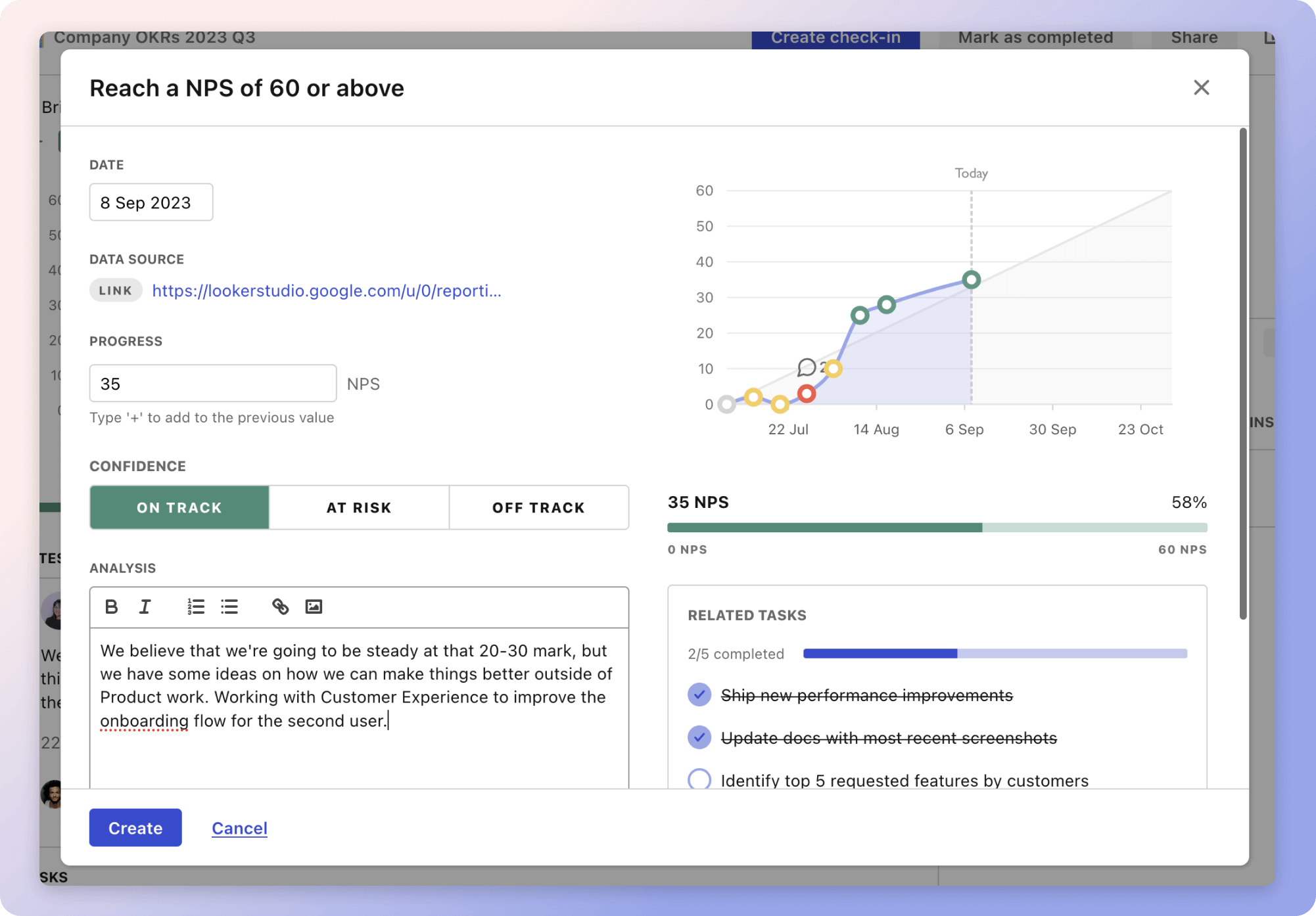
The plan revolves around enhancing the effectiveness of doughnut charts, which are crucial tools for data representation. By setting clear metrics like Completion Progress, Audience Understanding, and Visual Appeal, the plan aims to ensure that these charts are both informative and engaging. For instance, ensuring a high Audience Understanding rate ensures that most viewers can accurately interpret the charts, making the visualizations more effective in conveying information.
Visual Appeal and Information Retention are equally important metrics, focusing on how well audiences engage with and recall the data presented. High levels of Visual Appeal might include consistent color palettes, while strong Information Retention could involve highlighting key data points. By considering these factors, the goal is to make doughnut charts not just a means to display data, but a tool to tell a story and influence decision-making.
Top 5 metrics for Doughnut Chart Effectiveness
1. Completion Progress
Percentage of the project's or task's progress visualised in the doughnut chart
What good looks like for this metric: Typically aims for 100% by project's end
How to improve this metric:- Ensure data accuracy before visualisation
- Update data regularly to reflect current progress
- Use clear and contrasting colours
- Limit the amount of data to avoid clutter
- Provide contextual information or labels
2. Audience Understanding
Percentage of the audience that correctly interprets the doughnut chart
What good looks like for this metric: 85% understanding rate for visualisations
How to improve this metric:- Include a legend explaining the chart
- Use annotations or callouts for key data points
- Simplify complex data into more straightforward visuals
- Conduct a test presentation and gather feedback
- Ensure the chart is accessible to all audience members
3. Visual Appeal
Measure of the how visually pleasing the doughnut chart is to the audience
What good looks like for this metric: High engagement and positive feedback from over 75% of viewers
How to improve this metric:- Use a consistent and appealing colour palette
- Maintain a balance between data and design
- Ensure the chart is appropriately sized for readability
- Incorporate interactive elements if possible
- Seek graphic design feedback
4. Information Retention
Percentage of information retained by the audience after viewing the chart
What good looks like for this metric: Over 70% retention of key data
How to improve this metric:- Highlight key figures and trends within the chart
- Use bite-sized information for easier digestion
- Include a summary or recap of important data
- Engage the audience with interactive features
- Regularly review the chart's impact through surveys
5. Narrative Coherence
How well the doughnut chart complements and enhances the presentation or report
What good looks like for this metric: Cohesive integration leading to smooth presentations
How to improve this metric:- Align chart data with the overall narrative
- Use consistent theming between charts and texts
- Ensure clarity in the transition between topics
- Provide story-driven context around numbers
- Regularly refine presentation flow and sequence
How to track Doughnut Chart Effectiveness metrics
It's one thing to have a plan, it's another to stick to it. We hope that the examples above will help you get started with your own strategy, but we also know that it's easy to get lost in the day-to-day effort.
That's why we built Tability: to help you track your progress, keep your team aligned, and make sure you're always moving in the right direction.

Give it a try and see how it can help you bring accountability to your metrics.