This plan focuses on setting clear metrics to evaluate UX designer performance, underlining why these metrics are vital in creating user-friendly designs. The User Satisfaction Score, for example, reveals how users perceive the design through direct feedback, guiding designers to enhance user experience significantly. Meanwhile, the Task Success Rate measures usability, ensuring tasks can be completed efficiently without issues, which is crucial for smooth user interaction.
The Time on Task metric provides insights into the efficiency of task completion, essential for reducing user frustration. A high Design Consistency Score ensures a seamless user experience across different interfaces, promoting brand recognition and ease of use. Lastly, the Feedback Implementation Rate gauges how well user feedback is integrated, fostering a user-centered approach to design enhancements.
Top 5 metrics for Assessing UX Designer Performance
1. User Satisfaction Score
Measures overall satisfaction of users with the design through surveys and feedback.
What good looks like for this metric: Average score of 75%
How to improve this metric:- Gather regular user feedback
- Implement a user-centred design approach
- Conduct usability testing
- Iteratively refine designs based on user input
- Ensure consistent design standards
2. Task Success Rate
Percentage of users able to complete tasks without issues in the design.
What good looks like for this metric: 80% completion rate
How to improve this metric:- Simplify navigation paths
- Provide clear instructions
- Ensure responsive design
- Identify and fix usability issues
- Use tools to track task completion
3. Time on Task
Average time users take to complete specific tasks using the design.
What good looks like for this metric: Depends on task complexity
How to improve this metric:- Analyse task flows for efficiency
- Reduce unnecessary steps
- Provide shortcuts for frequent actions
- Test design with diverse user groups
- Enhance layout clarity and intuitiveness
4. Design Consistency Score
Evaluates how consistently the design elements are applied across the interface.
What good looks like for this metric: 90% consistency level
How to improve this metric:- Establish design guidelines
- Conduct regular design audits
- Use style guides and templates
- Train team on design standards
- Promote a culture of consistency
5. Feedback Implementation Rate
Ratio of user feedback items successfully implemented into design improvements.
What good looks like for this metric: 70% implementation rate
How to improve this metric:- Track all user feedback
- Prioritise feedback based on impact
- Implement feedback in agile cycles
- Engage users for feedback validation
- Communicate feedback impacts to users
How to track Assessing UX Designer Performance metrics
It's one thing to have a plan, it's another to stick to it. We hope that the examples above will help you get started with your own strategy, but we also know that it's easy to get lost in the day-to-day effort.
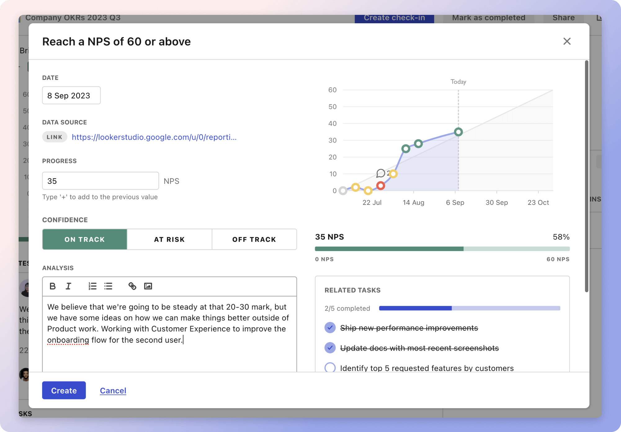
That's why we built Tability: to help you track your progress, keep your team aligned, and make sure you're always moving in the right direction.

Give it a try and see how it can help you bring accountability to your metrics.